
This ReViz project is probably my favourite that I have undertook so far. Remaking something of such historical significance was great, and building it was incredibly challenging but fun as well.
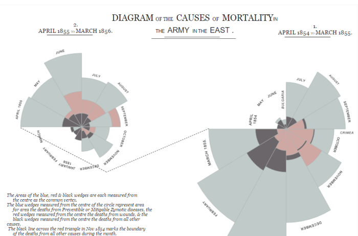
You have probably heard of this visualisation’s designer, Florence Nightingale, a British nurse famed for her contribution to modern nursing and the graphical representation of data.
This visualisation was produced during the Crimean war where Nightingale meticulously collected data on mortality rates of soldiers whilst serving in the British camp. The visualisation captured the attention of key stakeholders who quickly saw that sanitation was a key influencing factor on death rates in war zone hospitals, and introduced policy to control this.
It is seen as one of the finest examples of how visualising data can play a key role in triggering conversation and aiding the decision making process, especially given what was at stake; peoples lives.
As a result of Nightingales visualisation and the policies introduced, the death rate was seen to fall from 42% to 2% (Dictionary of National Biography, 1911).
Because of this visualisations significance in the data world I decided to give it a go using Tableau and Alteryx. Of course, this type of chart, a ‘coxcomb’ is not a supported chart type so I new that I would have to create the segments using polygons.
The ‘coxcomb’ whilst looking complex, is in principal very simple, the number of dimension members represents the number of segments; the measure value represents the size.
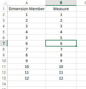
I decided to first use a very basic dataset, with 12 dimension members with a measure value. I find that by bringing things to their most basic point it helps make understanding what you are doing much clearer.
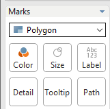
Next you need to understand how Tableau draws polygons. you must have an X and Y point for each mark, Tableau draws lines between these marks based on the order you define or ‘Path’.
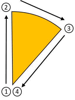
We already know two points for each of our segments. The starting point is going to be the centre of the pie (0,0) and the end point is going to be the centre of the pie (0,0). The x and y coordinates of the points between depend on the angle and size at that point.
So how do you calculate the x and y value of a point on the edge of a circle. Well this is where my data school colleague Simona Loffredo’s ‘math blog’ came in handy.
x = r*cos(alpha) – r being our radius, alpha being the radians value of our angle, which can be calculated as angle*(PI()/180)
y = r*sin(alpha)
For an examples sake lets say point 2 is at 0 degrees and the radius is 1.
so x = 1*cos(0) = 0
y = 1*sin(0) = 1
So point 2 is at (0,1).
Of course, with a coxcomb chart the radius is not a set value, it depends on the measure value it’s self. So woo, more maths!
The radius in this case for each individual segment can be calculated as:
SQRT([Measure])/((PI()*(1^2))/[Count]))
Where our [Measure] is the value for that dimension member and the [Count] represents the number of segments.
So what the hell does this actually mean.
Well for each point on the edge of the circle we need the following information:
- The angle
- The radius
- The total number of segments
- Some mathematical understanding
Given the length of this post I have decided to split it into two posts. For this first part we have looked at the underlying principals to help us build our coxcomb visualisation. The next part focusses on the actual build of the visualisation data in Atleryx.
Ben
#VizLikeAnArtist

2 thoughts on “#ReViz – Coxcombs in Tableau – Part 1”